
When sending marketing emails, how much thought you do actually put into the typography that you use? The truth is that no matter how much effort you put into writing great copy and coming up with stunning designs for your emails, your email won’t get the results you want if it does not communicate information effectively.
One of the main things that can significantly influence how your emails are interpreted by your subscribers, the impression that your business makes, and whether or not subscribers follow through on your call-to-action is the fonts that you choose to use.
However, when it comes to typography in your emails, your options might be limited by the different email platforms when it comes to custom fonts, and web fonts, and how they are incorporated into your design.
Keep reading to find out more about the best fonts, font sizes, and best font practices for email.
Why do fonts matter for email marketing campaigns?
Have you ever received an email that you were immediately put off reading because of the font that was used in the email content?
When this happens, the main reason is usually because the text is difficult to read. Most subscribers in this situation aren’t going to try and make the effort to read the email; instead, they just move on to the next one.
Experts suggest that typography is the ‘body language’ of the online world. With good typography, you can enhance the character of your website or business emails, adding a tone of voice that reinforces what the words say and influences how they are perceived.
Good typography can be one of the best ways to enhance the message in your email content, making it easier to read and understand. As a result, your email marketing campaigns can perform better too.
How fonts in email can make a difference
The font that you use for your emails can be all the difference between subscribers clicking through to your site or unsubscribing from your email newsletter completely.
When you have a better understanding of typography, this can help you choose the right fonts for your emails and ensure that subscribers are more likely to read through your emails and follow the call to action.
Plus, it sends the message to your subscribers that you are serious about your design and message. Besides email images, fonts are crucial for the success of your email campaigns.
Understanding the different email font types
Unfortunately, you can’t just pick any old font that you like when it comes to writing your email copy. Since there are lots of big players in the email industry with different interests and priorities, there are no email standards which has led to limitations around widths, responsive design, coding, scripts, and fonts.
In general, email design best practice includes using email-safe or web-safe fonts since they are reliable and you can count on them to display as intended. Tahoma, Georgia, Arial, Helvetica, Trebuchet, Times, Verdana, and Lucida are some of the most popular email-safe fonts to use.
However, just going with popular fonts should not be the default choice for email marketers.
Which is the best email font?
While there is no one best email font to use, there are several fonts that you can safely use cross-platform and trust to display correctly.
These are:
- Serif fonts: Times, Times New Roman, Courier, Courier New, and Georgia
- Sans Serif typefaces and fonts: Verdana, Tahoma, Arial, Arial Black, Trebuchet MS, and Lucida
- Monospace: This category includes fonts such as Courier, Courier New, Monaco and Lucida Console
You can also use an italic typeface for each of the fonts suggested here.
Some email-safe fonts that are supported by the majority of popular email platforms include:
- Verdana
- Trebuchet MS
- Tahoma
- Times New Roman
- Georgia
- Lucida
- Courier New
- Arial
- Comic Sans MS
Some email platforms also support several custom fonts, such as:
- Lato
- Merriweather
- Open Sans
- Source Sans Pro
- Roboto
- Noticia Text
- Playfair Display
- Lora
- Arvo
There are thousands of different fonts available besides the standard email-safe fonts that you will find available on most email platforms. Many brands and companies do use custom fonts, or fonts that have been specifically designed for them. If you don’t care for generic options and prefer going custom, make sure to have a fallback option in case your custom choice is not an email-friendly font.
Custom fonts are a great way to stand out from the crowd and can be a simple yet effective branding move. While you can code them in an email, many brands simply add them as an image at the top of the email, such as in their logo.
If you do decide to use a custom font or web font for your email, then it is a wise idea to specify a fallback font that is email-safe. This makes sure that you have a backup font in case your chosen font does not display correctly. For example, some custom solutions will not make your emails accessible, rendering them unreadable.
What are the best email fonts?
Since email subscribers generally scan through the emails that they receive a couple of paragraphs at a time, the most important thing is to make sure that you are using a font that has letters with consistent and wide spacing so that they are easy to read. It’s not just about having a friendly appearance – the fonts should be legible too.
Some of the most foolproof choices for fonts in email include:
Times New Roman
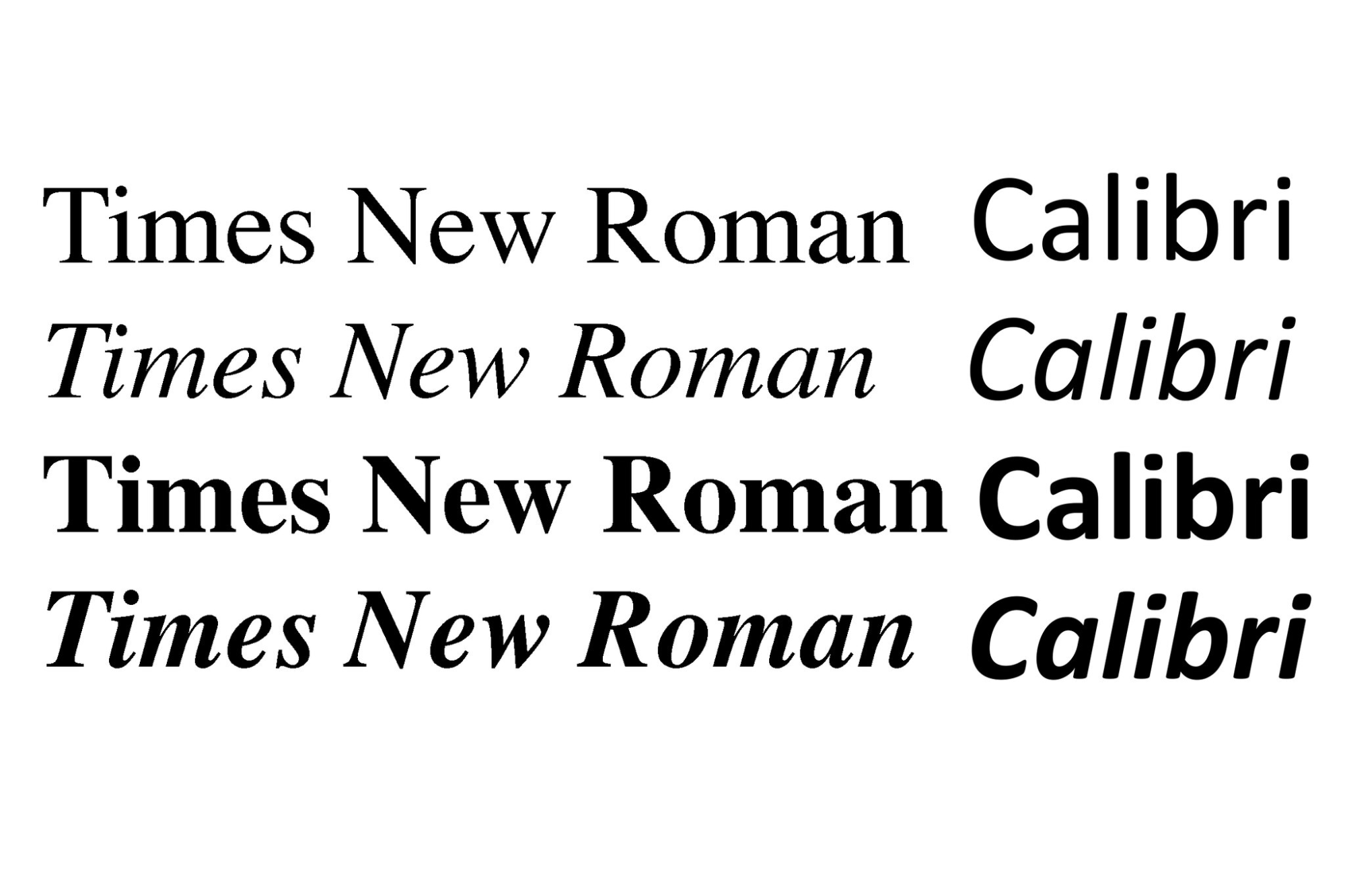
This font was created by The Times magazine all the way back in 1931, and there’s a good reason why it has been used a lot ever since. This serif design gives the letters exaggerated strokes, and is it used as the default font for several word processing programs including MS Office. It is professional with an editorial feel, which makes it a good choice for most emails.
It’s also easy to read on low-resolution screens, both for uppercase and lowercase letters.
Verdana
Named for the designer Matthew Carter’s daughter Ana and combined with the word verdant, this font is known for being one of the easiest-to-read fonts you can find. It has evenly, similarly shaped letters that create clarity and consistency. Uppercase letters are larger, which makes it easier to read.
Georgia
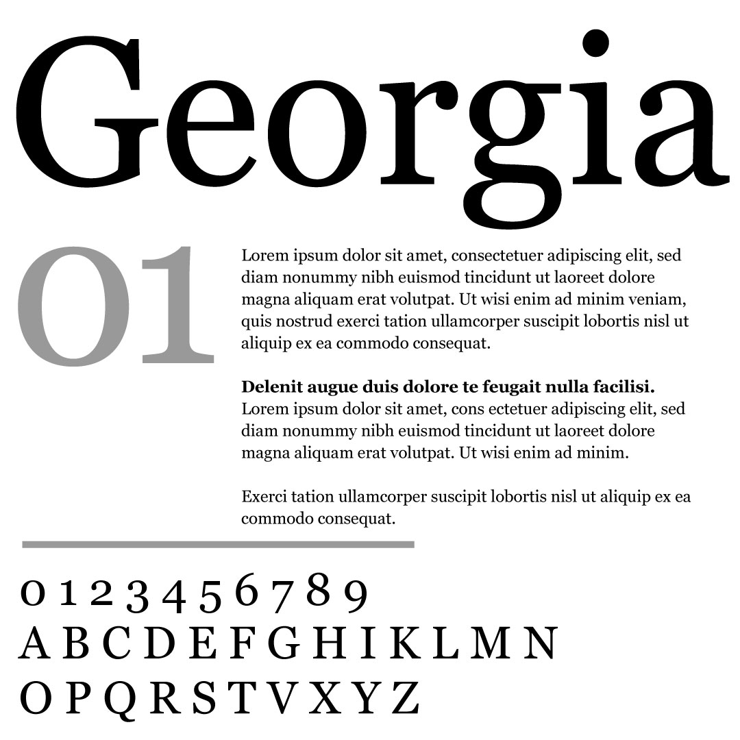
Georgia is another serif font that is similar to Times New Roman. Originally designed in 1993 for Microsoft, it has been widely used for newspapers and novels ever since. It has generous spacing and heavy strokes that make it easy to read and encourage the eyes to flow to the next word. This makes it one of the safest choices for fonts in email and of the most common fallback fonts for email marketing.
How to choose a professional font size for email
Along with choosing the right font, another important consideration to make when you are designing an email is how big the font is going to be. Font size is one of the main factors that can make an email easy or difficult to read no matter what font you choose.
If your font size is too small, readers are going to struggle to take any of the information in. However, on the other end of the spectrum, a font size that is too big is going to be overwhelming and might cause the reader to scroll far too many times to get to the end of the message.
Just like web pages, subscribers will usually scan through a marketing email to find what they are looking for rather than reading every word. This can be made easier by choosing a larger font size, which can also help to increase the response and click-through rates.
Experts recommend using between 22-28 pixels for your email header, and between 15-18 pixels for your body text. Bear in mind that the font you are using can also have an impact on the font sizing that you choose, so spend some time experimenting with your design, and don’t forget to test it for smartphones.
Font colors to choose
When using color in your emails, it is important to make sure that it is consistent by sticking to what you are already using for your website and brand. While color can certainly help to grab attention in an email, it’s a good idea to keep your color use as simple as possible.
Ideally, you shouldn’t use more than three colors in the same email – this adds just the right amount of interest and looks aesthetically pleasing without being confusing or cluttered. Don’t go for colorful, decorative fonts and don’t go wild with your color combinations –
Line spacing tips
You can choose an amazing font, but if the letters are too close together, this can also make it difficult to read. This is why you should also pay attention to line height or line spacing when writing your emails. This refers to the white space that is in between each paragraph or line.
If there’s not enough, your email body is going to look like a huge block of text that might put some readers off. On the other hand, if there’s too much line spacing, then the email might appear disjointed.
Ideally, your line spacing should be somewhere around 1.4 or 1.5. Like font sizing, however, this can also vary depending on the fonts that you are using, so spend some time experimenting to see what works well.
Choosing the right fonts for the header and body
The headline font of your email can be different from the body font, allowing the message to stand out and catch the subscriber’s attention. There don’t have to be huge differences – in some cases, the body text made bold can work very well. For your body font, it’s best to use a font that is neutral and readable.
The font that you use for your emails can have a huge impact on how the message is interpreted and how effective the email is overall.
Wrapping up
If you thought that choosing decorative fonts or custom web fonts for your email marketing is a clever idea, think again. Standard fonts perform better than all other types of fonts – not just for email but for all other forms of digital content.
Today, we’ve rounded up some of the most popular choices of modern fonts you can use to get in touch with your email list. Power up your email marketing strategy with these font choices and make a safe bet every time.
And if you want to make sure your messages reach the right email inbox, you need to clean up and verify your email lists. With Bouncer, you can validate your lists and remove inactive, fake, double and other invalid emails.
Sign up today to validate your first 100 email addresses for free!
